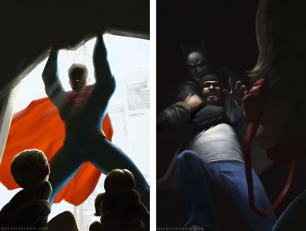
What do you think each of the batfamily’s handwriting looks like?

robin-nightwing:

holyheadcanonsbatman:

Bruce: slightly rushed cursive but is legible for the most part

Dick: lots of loops and fairly small writing

Jason: super dark and heavy writing, very angular

Tim; entirely illegible, the stereotypical doctor writing

Damian: light and neat, usually slanted

Cass: kind of shaky, distinct letters

Steph: bubbly, neat and slightly large

Babs: small, kind of like cursive but also like printing

Duke: kind of messy but still legible, medium sized

@holyheadcanonsbatman

batmanfamilybatfamily:

[During a battle between some criminals, Dick saves Damian from being hit by a stray bullet. Afterwards, in the Bat Cave, Damian approaches Dick]

Damian: In light of what you did for me… you can hug me for four to five seconds.

Dick: [Eyes wide] FOURTY-FIVE SECONDS?!

Damian: NO! Four to fiv- [Cut off by Dick wrapping into a bone crushing hug] FOUR TO FIVE!

merkymerx:

Revisited the Supergirl painting I made 2 years ago.

I felt the face and expression needed some improvement. I wanted her to look more charming. Also stayed a bit more true to the hair Al Plastino drew.

As much as I love the Fleischer shield I originally had on, nothing still compares to the iconic design we’re all familiar with.

wisegirlandseaweedbrainforever:

The best thing about Dick Grayson is you put him with the other Bats and he appears to be a friendly, lighthearted, jokester, but you put him with other heroes and he suddenly looks uptight, paranoid, and seriously lacking in average social graces. Nothing about his character has really changed it’s just that this uptight and paranoid boy is friendly, and lighthearted compared to the complete emotional constipation of the other bats😂 He’s a perfect middle ground between the Bats, and the other heroes.